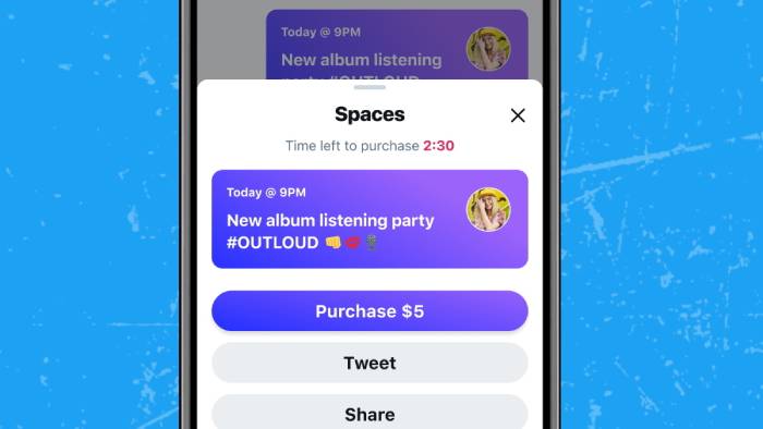
Finally, Android users may now modify the navigation bar in the Twitter Blue app. This feature, which was previously exclusive to iOS, allows you to remove the Spaces icon from the middle of your navigation bar (and of course, remove some of the other tabs if you want, too).
If you’re sick of having to extend your finger over the Spaces tab to access your DMs and notifications, custom navigation lets you display as few as two tabs at a time or maintain all five that are displayed by default.
The Spaces tab was first tested by Twitter on iOS last year and appeared on Android in May, which seems to encourage more irritated users to subscribe to the $2.99/month Blue plan introduced last year.
However, Blue can’t shield us from all of the features that are cluttering up the app. Last week, Twitter made an announcement about adding more information to the banner that displays active Spaces at the top of your timeline.
While there is currently no option to completely disable this banner (neither for free users nor Blue subscribers), it will now display information about the Space’s host, everyone who tweets in the Space, and relevant Topics.
- NCAA Women’s Gymnastics Semifinals 2025: When and Where to Watch - April 17, 2025
- World Cup 2026: American Airlines Signs Sponsorship Deal With FIFA - April 17, 2025
- National Exercise Day 2025: How a Daily Walk Can Boost Your Body & Mind - April 17, 2025


